
Visualizing Inequality: A Tableau Data Story on India’s Digital Divide
Why Static Reports Fail to Tell the Whole Story
Despite rapid digital growth, a massive gap remains in how different socioeconomic groups access the internet. While raw numbers might show growth, static reports often fail to engage non-technical audiences with the actual depth of digital inequality.
At Statssy, we believe that data only becomes powerful when it tells a story. We developed this interactive Tableau data story to narrate the status of internet access across India, highlighting how it correlates with education, income, and geography.
The Findings: A Multi-Dimensional Divide
Using data from the National Sample Survey Office (NSSO) and NFHS-5, our analysis uncovered four critical disparities that impact education, healthcare, and employability:
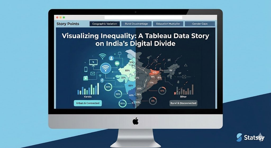
- Extreme Geographic Variation: There is a staggering 40% spread in access between leading regions like Kerala (over 70%) and lagging states like Bihar (below 30%).
- The Rural Disadvantage: In 17 states, rural internet penetration was less than half the rate of urban areas.
- The Education Multiplier: Individuals with higher education levels showed over 4x higher digital inclusion compared to those in the same income group with less education.
- Persistent Gender Gaps: In states like Rajasthan and Madhya Pradesh, the digital gender gap exceeds 20%, requiring targeted policy intervention.
The Technical Solution: Interactive Data Storytelling
To make this data accessible for decision-makers and NGOs, we moved beyond basic charts and utilized advanced Tableau Story Points:
- Guided Narrative: We used “Story Points” to walk users through the data step-by-step, ensuring the most impactful insights weren’t missed.
- Interactive Deep-Dives: We enabled custom filters for gender, income quintile, and education level, allowing stakeholders to identify specific vulnerable demographics.
- Annotated Mapping: Integrated maps provided immediate visual context for regional disparities.
Methodology & Tools
Our team handled the end-to-end data pipeline, from raw household consumption data to a polished public awareness tool.
- Data Consolidation: Cleaned and standardized using Excel and OpenRefine.
- Visualization: Developed entirely within Tableau Desktop.
- Data Sources: NSSO 2017-18, NFHS-5, and TRAI telecom reports.
Need a Custom Data Story for Your Organization?
Whether you are an NGO in Europe looking to visualize social impact or a US-based firm needing to turn complex market data into a compelling narrative, we can help.
A well-designed dashboard doesn’t just show data; it drives advocacy and informs policy.