
Looker Studio Sales Dashboard for a UK Marketing Analytics MSc Dissertation
A Looker Studio sales dashboard was the last thing on this student’s mind when they first messaged me. Their MSc Marketing Analytics dissertation deadline was eleven weeks away at a UK university. The modelling was already sorted and the dataset was clean. What was missing was a way to actually show the findings to an examiner, and that gap ended up changing the dissertation’s core conclusion.
I run Statssy, and I have spent twelve years helping dissertation students with statistics, data cleaning, and now increasingly with dashboards, because supervisors keep asking for interactive reports instead of static tables buried in an appendix. This is the kind of MSc marketing analytics dissertation help that rarely turns up in a generic tutorial. This article walks through exactly how I built this one, including the mistake most Looker Studio dashboard for dissertation guides never mention.
Key Takeaways
- A sales dashboard in Looker Studio needs a proper database behind it, not just a spreadsheet, once your dataset passes a few tens of thousands of rows.
- Promotion uplift is not simple subtraction. The baseline you compare against decides the entire result.
- Averaging store-level uplift percentages instead of summing totals first is the most common, most invisible error in student dashboards.
- Looker Studio’s data blending can silently inflate numbers through a bug called fan-out.
- The dashboard’s real contribution here was descriptive, not causal, and knowing that difference is what gets you through a viva.
Why This Dissertation Needed a Looker Studio Sales Dashboard
The dissertation examined how promotional pricing affected sales across retail channels, using two years of transaction data from a partner retailer. The supervisor wanted an interactive dashboard for the viva, one an examiner could filter by channel, category, and region, rather than flipping through printed tables.
What the rubric and supervisor actually wanted
The marking rubric weighted data visualisation and communication of findings heavily. A Word document with static charts does not score well against that. If your own rubric mentions “communication of insights” or “interactive analysis,” a dashboard is not decoration. It is the difference between a good mark and an average one on that line item.
The Retail Dataset Behind the Dashboard
Before opening Looker Studio, I asked for three things: the raw extract, the codebook, and the cleaning script the student had already written. Dashboards usually fail at the data layer, not the visual layer, so that order matters.
The raw data had roughly 480,000 transaction line items across 42 stores, 1,180 SKUs mapped to 12 categories, and 96 promotional windows with start dates, end dates, and discount depth. Two years of weekly data across those stores and categories gives a fact grain of around 52,000 rows once aggregated. This is a good example of secondary data used well, and if you are still deciding between collecting your own data or working with an existing dataset, our guide on choosing primary or secondary data for a dissertation is worth reading first.
Looker Studio Sales Dashboard: Google Sheets vs BigQuery
Most tutorials tell you to connect a sales dashboard in Looker Studio straight to a Google Sheet. It is free and quick, and for a small dataset it works fine. I did not take that route here.
The Sheets connector gets sluggish past a few tens of thousands of rows, since every filter click re-reads the whole sheet. Looker Studio extracts also cap out around 100 MB, so a growing dataset can hit a wall without warning. For 480,000 raw rows, that ceiling was too close for comfort.
I connected a Looker Studio BigQuery dashboard instead, using the BigQuery sandbox, which needs no billing account. The real advantage was not speed. It let me do the aggregation in SQL and hand Looker Studio a small, pre-aggregated table, instead of asking the report to crunch half a million rows on every click.
Power BI is the other tool students ask me about, and it is genuinely stronger for complex data models and DAX calculations. Most UK marketing dissertations do not need that power, though, and Looker Studio’s free tier and one-click share link get you to a viva-ready report faster. If your project already leans on Power BI, our Power BI dashboard support covers that build instead.
BigQuery sandbox limits every student should know before relying on it
- Sandbox tables expire after a set number of days by default, ours were set to 60, so we set a calendar reminder and kept a Python script ready to re-upload the data.
- The sandbox does not support scheduled refreshes from external sources. Our pipeline stayed manual, which is fine for a dissertation, not a live business.
- Check the current sandbox limits before relying on them, since Google has changed these terms before.
Building the Data Model: A Star Schema for the Sales Dashboard
I built a small star schema inside BigQuery rather than dumping raw rows into Looker Studio. The fact table sat at store, week, and category grain, with fields for units sold, gross and net sales, promo days, and average discount depth. Two dimension tables held store attributes and category attributes.
A third table, the date dimension, mattered more than the fact table itself.
Why a complete date spine stops your time series from lying
Definition: A date spine is a complete calendar table, one row per day across your full date range, that guarantees every period appears in your data even when there was zero activity in it.
Without one, a week where a store sold nothing in a category simply does not exist as a row. Your time series chart then shows a gap that looks like missing data, when it is actually a true zero. I generated the spine in Python, cross-joined it against the store and category dimensions, and left-joined the fact data onto that skeleton, coalescing nulls to zero.
The Real Problem: Calculating Promotion Uplift Correctly
Definition: Promotion uplift is the extra sales a promotion generates, measured against what would have sold anyway without it. That “what would have sold anyway” figure is the baseline, and it is where most of the real difficulty sits.
This is the part of the project that made it into the dissertation as a genuine contribution, not just a chart. Promotion uplift sounds like simple subtraction, but you need a defensible counterfactual, and that counterfactual is a judgement call, not a formula.
Three baseline methods compared
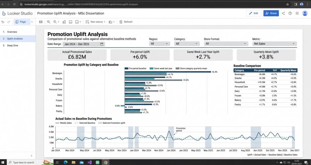
We calculated three baselines side by side so the student could justify a choice in the methodology chapter.
| Method | Best for | Main risk |
|---|---|---|
| Pre-period baseline | Non-seasonal categories, quick to compute | Understates demand if pull-forward is happening |
| Same week last year | Seasonal categories, repeat promotions | Ignores genuine year-on-year growth or decline |
| Store-category quarterly mean | Smoothing short-term noise | Can hide a real trend shift within the quarter |
Most online guides on sales lift stop at the pre-period method and present it as the only option. That works for a quick estimate, but a dissertation examiner will ask why you did not test at least one alternative, and “a blog post told me to” is not an answer that survives a viva.
Ratio of sums vs average of ratios, the invisible error
This is the mistake I see most often in student dashboards, and it never looks wrong on screen. Uplift has to be calculated as a ratio of sums: total actual sales minus total baseline sales, divided by total baseline sales, summed first and divided once at the end.
If you instead calculate uplift per store per week and average those percentages, small stores with volatile sales get the same weight as large, stable ones. Your aggregate number comes out wrong, and it still looks plausible. In BigQuery, this is one function: SAFE_DIVIDE(SUM(net_sales) - SUM(baseline_sales), SUM(baseline_sales)).
Setting Up the Looker Studio BigQuery Dashboard
I connected Looker Studio to BigQuery using a custom SQL query instead of a plain table reference. That pushed the joins and the SAFE_DIVIDE logic into SQL, so Looker Studio only had to render an already-aggregated result.
Calculated fields that actually mattered
A dimension parameter with a dropdown let the student switch a single chart between revenue, units, and uplift percentage, instead of building three. One trap: you cannot wrap an aggregate inside a row-level CASE condition. CASE WHEN x = 1 THEN SUM(y) END works. CASE WHEN SUM(y) > 100 THEN ... throws a mixed-aggregation error, and I have hit this myself more than once.
Data blending and the fan-out trap
Definition: Fan-out is what happens when a blend’s join key has duplicate values on one side, causing rows to multiply during the join and silently inflating whatever you are summing.
I blended in store attributes using store_id as the join key. Google’s documentation on how blends work confirms blends aggregate each source before joining, which is the part that catches people out, since a duplicate key or a mismatched grain inflates your sales figures with no error message.
I checked the store dimension for duplicate keys before blending, and I would do that every time. For a dissertation, doing the join in SQL upstream and skipping Looker Studio blending entirely is usually the safer call.
What the Dashboard Pages Looked Like
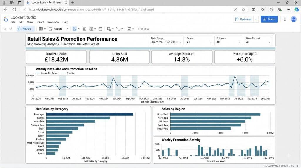
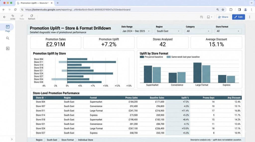
The final promotion uplift analysis dashboard had three pages. Page one gave a sales overview with a weekly time series, a moving average, and scorecards. Page two was the promotion analysis: uplift by category against all three baselines, plus a region-by-category heatmap in a sequential colour palette rather than red-green, for accessibility. Page three broke uplift down by region and store format, with a drill-down to individual stores.
Every page shared the same date range, region, category, and format filters, all pointing at the same date field, so one filter click updated the whole page instead of half of it.
The Finding: How the Dashboard Uncovered a Pull-Forward Effect
The aggregate uplift figure looked good on its own: a modest 6% positive lift, already written up as a clean result. The region-by-category heatmap told a different story. In the two largest categories, three of five regions actually showed negative uplift, and the positive aggregate was being carried entirely by high-volume stores in one region.
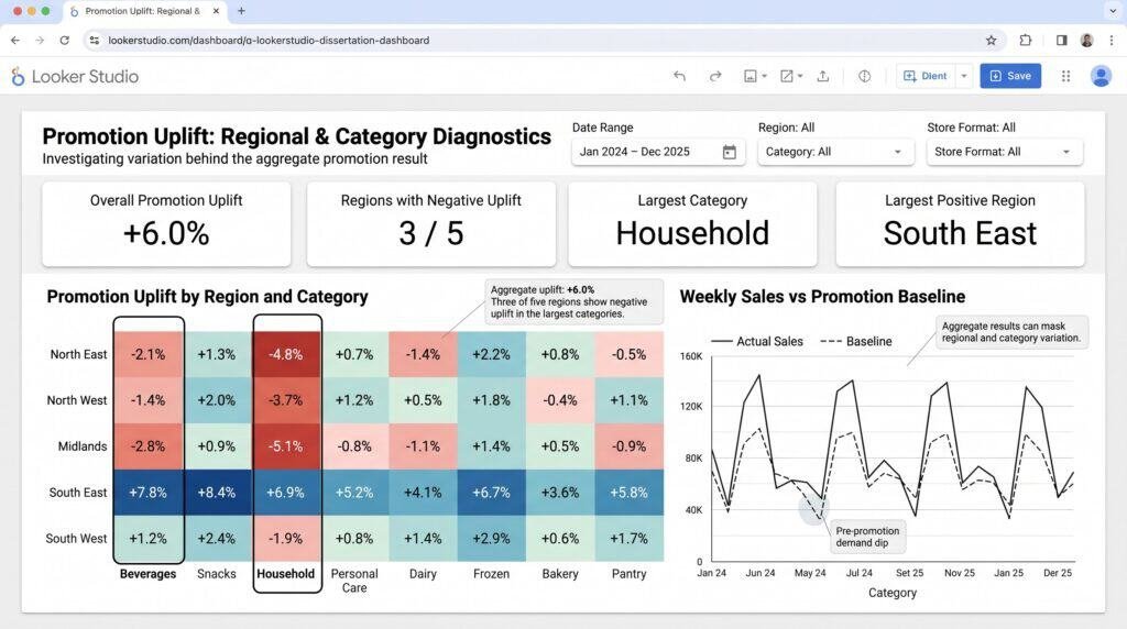
Pull-forward is when customers move a purchase they were already planning into a promotional window, instead of buying more overall. It makes a promotion look more successful than it actually was.
The time series chart, with the baseline drawn as a visible line instead of hidden inside a formula, showed sales dipping noticeably in the two weeks before most promotions, then dipping again briefly after, a pattern consistent with pull-forward. I have seen the same shape in another retail dissertation I supported, and it is easy to miss unless the baseline is actually drawn on the chart.
If the pre-period baseline is calculated from weeks where demand is already depressed because a promotion is coming, it understates true demand and the uplift figure overstates the promotion’s real effect. The student re-ran the analysis using the same-week-last-year baseline, and the uplift estimate dropped substantially. That comparison, plus a limitations section on pull-forward and cannibalisation, became a genuine methodological contribution rather than a decorative chart.
What I Deliberately Didn’t Do: Descriptive vs Causal
The dashboard is descriptive. It shows patterns clearly but does not prove causation. I was explicit with the student that a region showing high uplift on a heatmap is not evidence that the promotion caused it. That region might simply have larger stores or a different customer base.
Confusing a descriptive dashboard with a causal claim is one of the fastest ways to lose marks in a viva, and examiners test exactly this. If your dissertation involves a similar design question, our case study on marketing analytics in digital marketing covers the same descriptive-versus-causal distinction in more depth.
Getting Viva-Ready: A Practical Checklist
A dashboard that works on your laptop the night before is not the same as one that survives a viva room. We tested these specifically:
- Credentials: set the data source to owner’s credentials, not viewer’s, so the examiner can open the report without needing BigQuery access.
- Sharing: set the link to “anyone with the link can view,” and test it in an incognito window on a different machine before the viva.
- Offline fallback: export the key views to PDF and keep screenshots on a USB stick, since campus wifi failing mid-viva is common enough to plan for.
- Load testing: open the report on a laptop and a phone and time the load. Ours took around six seconds cold. Past ten seconds, you have lost the examiner’s attention before you have said a word.
A Word on Getting Help With This
If this sounds like more than you want to build alone with weeks left on the clock, that is a reasonable position to be in, not a shortcut to feel awkward about.
At Statssy, I offer the same Looker Studio and BigQuery dashboard support described in this article, built around your own data and your supervisor’s brief.
If you are still unsure whether your project needs outside help or just a clearer plan, this guide on knowing when you need a dissertation expert is a fair place to start.
And if dashboards are only one piece of a larger analytics gap, our business intelligence best practices roadmap covers the wider picture beyond a single report.
FAQ
Is Looker Studio free to use for a dissertation project?
Yes. Looker Studio itself is free, and the BigQuery sandbox used in this project also runs without a billing account, within its storage and query limits.
What is the difference between Looker Studio and Google Data Studio?
They are the same product. Google renamed Data Studio to Looker Studio, so both names still turn up in search results and older tutorials.
Can I build a sales dashboard with Google Sheets instead of BigQuery?
For smaller datasets, yes, and it is simpler to set up. Past a few tens of thousands of rows, Sheets connections get slow and hit Looker Studio’s extract size limit, which is when BigQuery becomes worth the extra setup effort.
u003cstrongu003eWhat happens when a BigQuery sandbox table expires?u003c/strongu003e
The table and its data are deleted after the default expiry period unless you re-upload it. Set a calendar reminder tied to your viva date, and back up your source data and load script separately.
What is a fan-out error in Looker Studio data blending?
It happens when a join key in a blended table has duplicate values, causing rows to multiply during the join and inflating your totals. It is silent, so numbers look normal until you check them against a known total.
How do you calculate promotion uplift correctly?
As a ratio of total sums, not an average of individual percentages: total actual sales minus total baseline sales, divided by total baseline sales. Averaging store-level percentages instead gives small, volatile stores the same weight as large ones and skews the result.
Is Looker Studio better than Power BI for a dissertation?
For most marketing dissertations, yes, mainly because it is free and easier to share with an examiner using a single link. Power BI is worth the extra setup if your project already needs complex data modelling or DAX calculations.
Is it academically acceptable to get help building a dissertation dashboard?
Getting support with tools and technical execution, while the analysis, interpretation, and conclusions stay your own, is standard practice and genuinely useful. Be clear with your supervisor about what support you used, and keep your own understanding of every chart sharp enough to defend it in the viva.
Written by Siddharth Gupta, founder of Statssy and twelve years into analytics consulting and dissertation support. He works hands-on with BigQuery, Looker Studio, Power BI, and statistical software for dissertation students and startups. Connect on LinkedIn.