
How to create and interpret histogram in R Studio 2025
What is a histogram?
A histogram is a graphical representation of the distribution of a variable. Distribution means a dataset is divided into “groups” called “bins,” and we assign each data point to one of the groups. Finally, we calculate the number of data points in each group and plot them as a bar graph.
Case 1 – Consider the height of all the students in your class
To create the histogram, we will enter this data as a vector in R
| 1 | 2 | 3 | 4 | 5 | 6 | 7 | 8 | 9 | 10 |
| 170 | 185 | 162 | 169 | 180 | 142 | 159 | 153 | 154 | 180 |
#Create a vector of data values in R

height <- c(170, 185, 162, 169, 180, 142, 159, 153, 154, 180)

#Create histogram using “hist()”

hist(height)
interpret histogram in R Studio
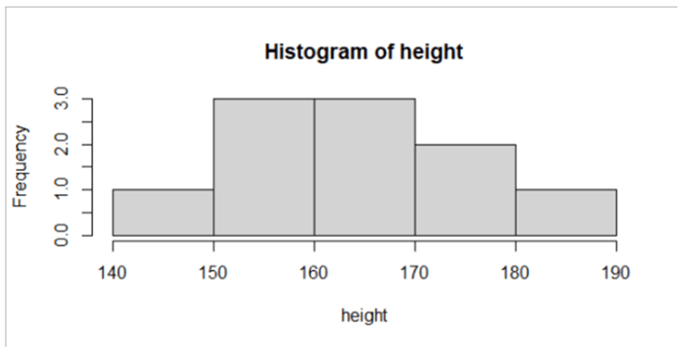
As you can see, the heights of 10 people from your class are classified into five groups. R has the power to self-assign correct group sizes and create the distribution. The distribution shows three people in the 150-160 group and two in the 170-180 group.
Now observe the histogram, and you will see that the frequency of the middle groups is higher than the extreme end groups, which looks like approximately a bell. Bell shaped means the distribution is approximately normal.
Case 2 – Consider the height of basketball players in your college (require long people)
| 1 | 2 | 3 | 4 | 5 | 6 | 7 | 8 | 9 | 10 |
| 170 | 185 | 175 | 169 | 180 | 142 | 181 | 179 | 182 | 184 |
To create the histogram, we will enter this data as a vector in R
#Create a vector of data values in R

height <- c(170, 185, 175, 169, 180, 142, 181, 179, 182, 184)

#Create histogram using “hist()”

hist(height)
interpret histogram in R Studio2024
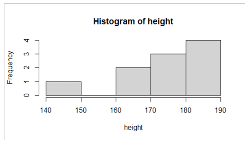
As in the above figure, there are more right-side group players than the left-side group. Why? Because we are talking about a basketball team where height is an important selection criterion. So indeed, the height of players will not be a bell-shaped normal distribution. In case when the right side of the group has higher frequencies than the left side, it is called left-skewed distribution.
Case 3 – Consider the height of rock-climbing players in your college (require short people)
| 1 | 2 | 3 | 4 | 5 | 6 | 7 | 8 | 9 | 10 |
| 144 | 143 | 142 | 147 | 148 | 142 | 159 | 147 | 162 | 154 |
To create the histogram, we will enter this data as a vector in R
#Create a vector of data values in R

height <- c(144, 143, 142, 147, 148, 142, 159, 147, 162, 154)

#Create histogram using “hist()”

hist(height)
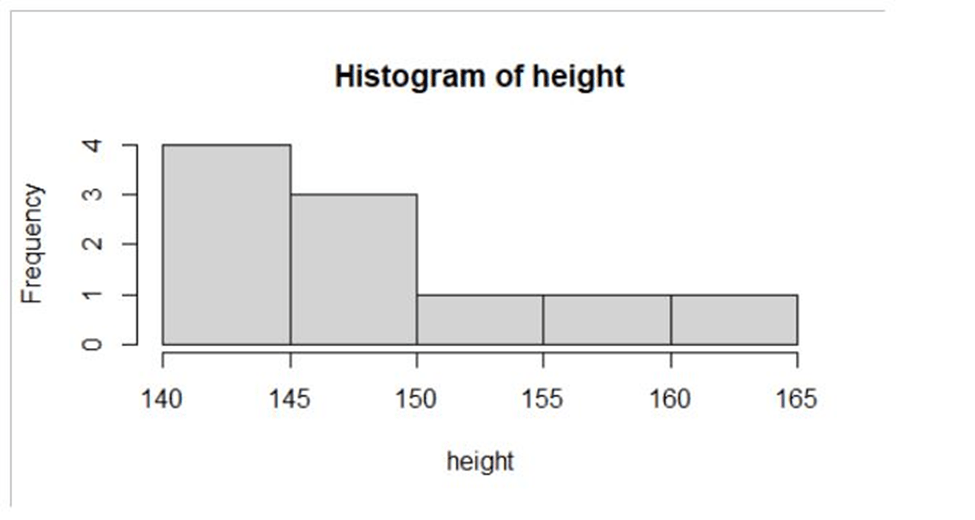
As shown in the above figure, more players have a height on the left side of the groups compared to the right side. Why? Because rock climbing generally requires short-height people.
Observe that this distribution is precisely opposite of the previous one, and since there are more people on the left side than on the right side, we call it right-skewed distribution.interpret histogram in R Studio
Conclusion : interpret histogram in R Studio
So now we have understood the basics of histogram, you can easily identify the distribution of a data using histogram and also interpret the distribution.