
How to create boxplot in python – Step by Step Tutorial in 2025
Hey there! Welcome to Statssy! In this tutorial, we will learn about building and interpreting boxplot in Python programming language
Ever found yourself drowning in a sea of numbers and just wished there was an easier way to make sense of it all? That’s where boxplots come in handy! They’re like the superheroes of data visualization, helping you understand how your data is spread out.
Today, we’re going to walk you through creating your very own boxplot in Python. Don’t worry, we’ll keep it simple and break it down step-by-step.
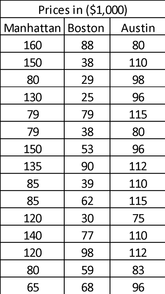
Imagine you’re planning to move to a new city—say, Manhattan, Boston, or Austin. You’re on a budget and want to find the most affordable place to live. Your real estate agent hands you a list of 15 home prices from each city. Just staring at those numbers won’t help, right? That’s where a boxplot can save the day, helping you easily figure out which city has more budget-friendly options.
Ready to find out which city will be kinder to your wallet? Let’s roll up our sleeves and dive into some Python coding!
Python Code to Create Boxplot
First things first, we need to bring in some helpers—two Python libraries that will make our job a lot easier. We’ll use matplotlib for making our boxplot look snazzy, and numpy to juggle the numbers behind the scenes.
from matplotlib import pyplot as plt
import numpy as np
So, what did that code snippet actually do? We brought in a part of the matplotlib library called pyplot and gave it a nickname—plt. It’s like calling your friend Robert “Rob” because it’s easier. We did the same with numpy, calling it np. These nicknames are pretty standard in the Python world, so we’ll stick with them.
Ready to dig into the numbers? Let’s take it city by city.
Starting with Manhattan:
To make a boxplot for Manhattan’s home prices, we’ll first gather all those numbers into a Python list. We’ll call this list manhattan_prices.
manhattan_prices = np.array([160,150,80,130,79,79,150,135,85,85,120,140,120,80,65])
Alright, quick detour: When you see np, just think of it as our trusty sidekick numpy. And the word array? That’s the special move we’re using to organize our data. This is Python’s way of saying, “Hey, let’s put all these numbers in a neat row!”
Excited yet? Because it’s showtime! Let’s create that plot.
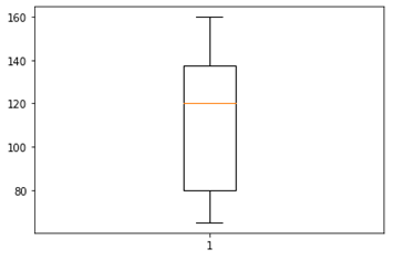
plt.boxplot(manhattan_prices)
Remember our friend plt from earlier? That’s short for pyplot, and it’s about to work some magic with a function called boxplot. Pretty straightforward, huh?
So, in Python, the recipe for making a boxplot goes like this:
libraryName.functionName(variableName)
Once you hit ‘Run,’ you’ll see a plot pop up on your screen. It’s like watching your data come to life!
It might look confusing first, but let’s understand it step by step.

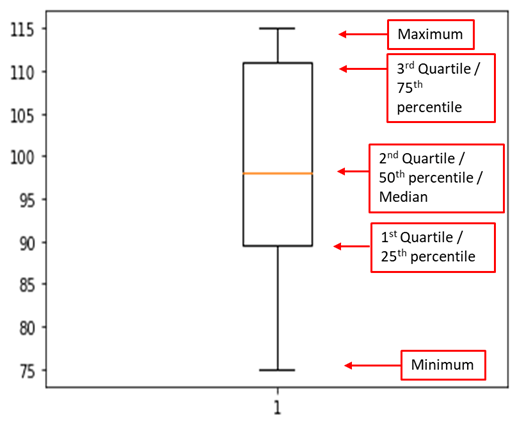
So, you’ve got your boxplot up, and it’s packed with info! Let’s break down what it’s telling us about Manhattan’s home prices.
- Maximum & Minimum: The highest price is a whopping $160,000, and the lowest is $75,000. Quite a range, huh?
- Median: The middle-of-the-road price is $120,000. That means half the homes are cheaper and half are pricier than this.
- 1st Quartile: At $80,000, this is the price below which a quarter of the homes fall. The rest are above this mark.
- 3rd Quartile: This is the $140,000 mark. Three-quarters of the homes are cheaper than this, and the rest are above.
Notice something cool? The space between the 1st quartile and the median is bigger than the space between the median and the 3rd quartile. That tells us more homes are clustered at the lower end of the price range. In geek speak, that’s called a “positively skewed” distribution.
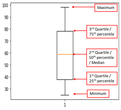
How to Interpret Boxplot
| Statistic | Value | Statistical Interpretation | Business Interpretation |
|---|---|---|---|
| Maximum | $160,000 | The highest home price in the dataset for Manhattan. | Indicates the upper limit of the housing market in Manhattan; not many options above this price point. |
| Minimum | $75,000 | The lowest home price in the dataset for Manhattan. | Indicates the entry-level price for the housing market in Manhattan; the starting point for budget buyers. |
| Median | $120,000 | 50% of homes are priced below this, and 50% are priced above. | A balanced price point that could be considered “average” for Manhattan; useful for budget planning. |
| 1st Quartile | $80,000 | 25% of homes are priced below this, and 75% are priced above. | Indicates a lower price range that is more accessible but may come with fewer amenities or less ideal locations. |
| 3rd Quartile | $140,000 | 75% of homes are priced below this, and 25% are priced above. | Indicates a higher price range that likely includes more amenities or better locations but is less accessible for budget buyers. |
| Skewness | Positive | More data points between the 1st quartile and median compared to the median and 3rd quartile. | Suggests that there are more affordable options available, but they may get snatched up quickly due to higher demand. |
Ready to do the same for Boston? Let’s jump right in with the next set of commands for Austin’s boxplot.
boston_prices = np.array([88,38,29,25,79,38,53,90,39,62,30,77,98,59,68])
plt.boxplot(boston_prices)
| Statistic | Value in Manhattan | Value in Boston | Statistical Interpretation for Boston | Business Interpretation for Boston |
|---|---|---|---|---|
| Maximum | $160,000 | $100,000 | The highest home price in Boston. | Indicates the upper limit of the housing market in Boston; fewer luxury options. |
| Minimum | $75,000 | $25,000 | The lowest home price in Boston. | Indicates a more accessible entry-level price for the housing market in Boston. |
| Median | $120,000 | $60,000 | 50% of homes in Boston are priced below this, and 50% are priced above. | A more affordable “average” price point for Boston; useful for budget planning. |
| 1st Quartile | $80,000 | $40,000 | 25% of homes in Boston are priced below this, and 75% are priced above. | Indicates a lower price range that is more accessible for budget buyers. |
| 3rd Quartile | $140,000 | $80,000 | 75% of homes in Boston are priced below this, and 25% are priced above. | Indicates a higher price range that is still more accessible than in Manhattan. |
| Skewness | Positive | Normal | The distribution of home prices in Boston is normally distributed. | Suggests a balanced housing market with a variety of options for different budgets. |
With this table, you can easily compare the two cities and see that Boston offers a more affordable range of home prices compared to Manhattan. The distribution of prices in Boston is also more balanced, making it a potentially better choice for those on a budget.
Lets dive further to our third location which is Austin,
austin_prices = np.array([80,110,98,96,115,80,96,112,110,115,75,110,112,83,96])
plt.boxplot(austin_prices)
| Statistic | Value in Manhattan | Value in Boston | Value in Austin | Statistical Interpretation for Austin | Business Interpretation for Austin |
|---|---|---|---|---|---|
| Maximum | $160,000 | $100,000 | $115,000 | The highest home price in Austin. | Indicates the upper limit of the housing market in Austin; fewer luxury options. |
| Minimum | $75,000 | $25,000 | $75,000 | The lowest home price in Austin. | Indicates the entry-level price for the housing market in Austin. |
| Median | $120,000 | $60,000 | $97,500 | 50% of homes in Austin are priced below this, and 50% are priced above. | A balanced “average” price point for Austin; useful for budget planning. |
| 1st Quartile | $80,000 | $40,000 | $90,000 | 25% of homes in Austin are priced below this, and 75% are priced above. | Indicates a lower price range that is more accessible for budget buyers. |
| 3rd Quartile | $140,000 | $80,000 | $112,000 | 75% of homes in Austin are priced below this, and 25% are priced above. | Indicates a higher price range that is still more accessible than in Manhattan. |
| Skewness | Positive | Normal | Negative | The distribution of home prices in Austin is skewed to the left. | Suggests that higher-priced homes are more common, potentially driving up the average price. |
With this table, you can now compare home prices across Manhattan, Boston, and Austin. Each city has its own characteristics in terms of affordability and distribution, allowing potential homebuyers to make a more informed choice.
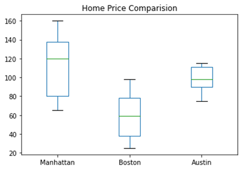
So we have understood how to create separate boxplots for each of the dataset. Now, lets combine all three to make our comparison easier.
import pandas as pd
# Pandas dataframe
data = pd.DataFrame({"Manhattan": np.array([160,150,80,130,79,79,150,135,85,85,120,140,120,80,65]),
                     "Boston": np.array([88,38,29,25,79,38,53,90,39,62,30,77,98,59,68]),
                    "Austin": np.array([80,110,98,96,115,80,96,112,110,115,75,110,112,83,96])})
# Plot the dataframe
ax = data[['Manhattan', 'Boston', 'Austin']].plot(kind='box', title='Home Price Comparision')
# Display the plot
plt.show()
Here I used “pandas” a library in python to create data in form of rows and columns. It is called a dataframe. I imported pandas as “pd” to do this.
Conclusion
So, what did we learn from our deep dive into the housing markets of Manhattan, Boston, and Austin? Quite a bit, actually!
First off, if you’re looking for a high-roller lifestyle, Austin might be your jam. The data shows that home prices there are generally on the higher side.
Manhattan, surprisingly, offers more affordable options. Yep, you read that right! The data leans towards the lower end, making it a good choice if you’re budget-conscious.
As for Boston, it’s the Goldilocks of our trio—offering a bit of everything. Whether you’re looking for a budget-friendly starter home or something a bit more upscale, Boston has you covered.
And if we’re talking numbers, Boston takes the cake for affordability. With a median price of just $40,000, it’s the clear winner for anyone watching their pennies.
So, if you’re planning a move and home prices are a big deal for you, Boston seems like the place to be!
How Boxplot Help in Decision Making
Let me give you some example about how boxplot will going to help in decision making in business
For Property Brokers:
If you’re a property broker, this data is pure gold. Use it to tailor your sales strategies. For instance, in Austin, you might want to target buyers looking for premium properties. In Manhattan, focus on advertising affordable options to attract a wider audience. And in Boston, offer a diverse portfolio to cater to both budget-conscious and luxury-seeking clients.
For Real Estate Buyers:
If you’re on the hunt for a new home, this info can help you zero in on the right city. Looking for luxury? Consider Austin. On a budget but still want options? Manhattan might surprise you. And if you want the best of both worlds, Boston is your go-to.
Further Reading
If you found this guide on boxplots helpful, you might also be interested in diving deeper into Python for data analysis. Learn how to calculate the Coefficient of Variation (CV) in Python for more precise data interpretation. Or, if you’re curious about another way to visualize data, check out our tutorial on how to create and interpret histograms in Python. And if you’re ready to take on a full-fledged project, don’t miss our guide on analyzing the most famous songs of 2023 using Python.