Hy dear reader, welcome to Statssy’s Guide on Data Visualization!
Introduction: Why Data Viz is Your New Superpower
Hey there, future Data Viz Wizard! Ever wondered how those jaw-dropping infographics or mesmerizing dashboards are made? Or how companies make sense of mountains of data to make game-changing decisions? Well, you’re in the right place! Welcome to the magical world of Data Visualization, or as the cool kids call it, Data Viz!
The Transformative Power of Data Visualization in Today’s Digital Age
Let’s get real for a sec. We’re living in an age where data is the new oil. But what’s the use of all that data if we can’t understand it, right? That’s where Data Viz steps in like a superhero! It turns complex data into simple, easy-to-understand visuals. Imagine transforming boring spreadsheets into vibrant charts or interactive maps. It’s like turning water into wine, but for data!
Data Viz isn’t just about making pretty pictures; it’s a powerful tool for storytelling. Whether it’s tracking climate change or understanding TikTok trends, Data Viz helps us see the bigger picture—literally!
Design Principles: The Cheat Sheet to Mastering Data Viz
Hey, you wouldn’t build a house without a blueprint, right? Same goes for Data Viz! Before we dive into the R vs Python showdown, let’s talk about some ground rules, or as we like to call them, Design Principles! These are your cheat codes to leveling up in the Data Viz game.
| S. No. | Principle | Explanation | How to Remember | wtf it means? |
|---|---|---|---|---|
| 1 | Modularity | Think of Data Viz like LEGO blocks. Each visual serves a specific purpose. | The LEGO Approach | Building a meme empire, one meme format at a time! |
| 2 | Context Independence | Your visuals should be versatile and fit any situation, like your favorite pair of jeans. | One Size Fits All | A Swiss Army knife that also has a TikTok account. |
| 3 | Clear Graphics | The clearer your graphics, the easier it is for people to understand your message. | Picture Perfect | A meme so clear, even your grandma gets it. |
| 4 | Style Neutrality | Keep your style neutral to appeal to a wider audience, like the “little black dress” of Data Viz. | Keep It Simple, Silly! | A PowerPoint template that even a pirate would love. |
| 5 | Graphical Content | Use icons, images, and other visual elements to convey information, like emojis in a text. | Show, Don’t Tell | A recipe told entirely in GIFs. |
| 6 | Textual Support | Use text to fill in the gaps where graphics alone can’t convey the message. | The Trusty Sidekick | A superhero duo where the sidekick is a hashtag. |
| 7 | Audience Adaptability | Make sure your visuals resonate with your audience, like a hit song. | Know Your Crowd | A playlist that’s half Billie Eilish, half Mozart. |
| 8 | Color Consideration | Never underestimate the power of a well-chosen color palette. It’s the seasoning to your Data Viz dish! | The Spice of Life | A food blog where the recipes are sorted by color. |
Now to give you an idea of the importance, imagine all these principles are running in a race, the one who wins is most important.
And there you have it! These design principles are your cheat sheet to becoming a Data Viz pro. Keep these in mind as we dive deeper into the R vs Python arena!
Introducing R and Python: The Titans of Data Viz
Hold onto your seats, because we’re about to introduce the Beyoncé and Jay-Z of the Data Viz world: R and Python! These aren’t just alphabet soup or names of your next pet snake; they’re the programming languages that are setting the stage on fire in the Data Viz arena.
R: The Academic Virtuoso
Meet R, the darling of statisticians and the VIP in academic lounges. With libraries like ggplot2, R is like that friend who knows how to turn any drab PowerPoint into a visually stunning TED Talk.
Visual: Bar chart comparing R’s strengths based on design principles.
Python: The Versatile Maestro
Now, let’s give a standing ovation for Python! This language is the jack-of-all-trades, mastering everything from web development to machine learning, and of course, Data Viz. Libraries like matplotlib and seaborn are Python’s secret ingredients for creating eye-popping visuals.
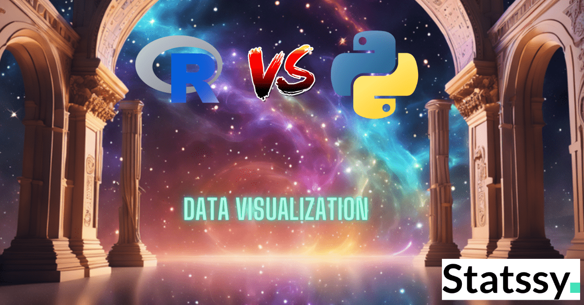
The Ultimate Showdown: R vs Python
So, you’re probably wondering, “Which one should I go for, R or Python?” Well, don’t break a sweat! This article is your VIP pass to understanding which of these titans will be your ultimate Data Viz sidekick.
We’re not just going to tell you which one is “better” because let’s be real, that’s like asking to choose between pizza and tacos. Instead, we’ll compare R and Python based on the design principles we just laid out. Yep, we’re talking modularity, context independence, clear graphics, and all that jazz!
So, stick around as we dive into this epic battle of R vs Python, all through the lens of our cheat-sheet design principles!
The Importance of Data Visualization in the Modern World
Hey, you! Yes, you scrolling through your endless TikTok feed or maybe diving into the latest climate change data. Ever wondered how all that information is so easily digestible? Well, welcome to the magical world of Data Visualization!
More Than Just Eye Candy: Data Viz as Storytelling 📖
Let’s get one thing straight: Data Visualization is not just about making your charts look like they’re ready for the Met Gala. It’s about storytelling, my friends! Imagine you’re at a party, and someone starts talking about, let’s say, global warming. You could either listen to them drone on with numbers and percentages, or you could look at a compelling visual that instantly shows you the melting ice caps and rising sea levels. Which one would you remember? Exactly!
Keywords: data visualization, TikTok trends, climate change data
Visual: Mindmap linking data viz to various hot topics like climate change and TikTok trends
The Thousand Words Behind the Picture
You’ve heard the saying, “A picture is worth a thousand words,” right? Well, let’s remix that a bit. A picture needs a thousand words—or maybe even more. For every stunning visual you see, there’s a whole backstory. Where did the data come from? Why was it collected? What’s the context?
Graphics alone can’t tell the whole story; they’re like the trailer to a blockbuster movie. They give you a taste, but you need to watch the whole film to get the full experience. So, the next time you see a jaw-dropping visual, ask yourself: What’s the story here?
The Evolution of Data Viz: From Cave Paintings to 4K Resolution
Oh boy, how far we’ve come! Better hardware and software have transformed Data Viz from mere doodles to high-definition masterpieces. We’re talking about more precise reproduction, vibrant colors, and faster drawing. It’s like going from stick figures to the Mona Lisa!
The Brainiacs Behind the Beauty: The Science of Data Viz
Computer scientists, statisticians, and designers have been working tirelessly to elevate the game. The development of a theory of graphics, especially thanks to works like Wilkinson’s “Grammar of Graphics” and Hadley Wickham’s ggplot2 in R, has been a game-changer.
The New Kids on the Block: Innovative Graphics
Remember the days when parallel coordinate plots and mosaic plots were like the nerdy kids in the Data Viz playground? Well, they’ve had a glow-up! These once rarely used and difficult-to-draw graphics have been refined and are now the life of the party.
Data Viz in the Wild: It’s Everywhere!
From scientific journals to your Instagram feed, Data Viz has infiltrated every aspect of our lives. And guess what? That’s a good thing! It means we’re asking more questions, sparking more debates, and making information accessible to everyone, not just the data nerds.
The Future is Bright: The Ongoing Revolution
The world of Data Viz is like a never-ending season of your favorite Netflix show; there’s always something new and exciting happening. With larger data sets, more complex models, and an ever-growing understanding of color and perception, the future of Data Viz is as bright as a supernova!
So, there you have it! Data Visualization is not just a tool; it’s a superpower that turns raw data into compelling stories, complex theories into digestible insights, and boring presentations into standing ovations.

Ready to become a Data Viz superhero? Stick around, because we’re just getting started!
The Ultimate Toolkit: Libraries and Tools
Alright, you’ve got the design principles down, and you’re pumped about the power of Data Viz. Now, what? Time to roll up those sleeves and get your hands on the ultimate toolkit!
R’s Arsenal: Where ggplot2 and Shiny Shine
ggplot2: The Artist’s Palette
Meet ggplot2, the Beyoncé of R’s Data Viz world. Seriously, if Data Viz is an art, then ggplot2 is your palette, your brushes, and your canvas all rolled into one. It’s the go-to for creating stunning, publication-quality visuals. Whether you’re plotting bar graphs or creating intricate heatmaps, ggplot2 has got you covered. It’s like the Swiss Army knife of R libraries, versatile and robust.
Why it’s a Big Deal: ggplot2 is built on the Grammar of Graphics, which means you can layer different elements to create complex visuals with ease. It’s like playing with LEGO blocks but for grown-ups who love data.

RColorBrewer: The Color Maestro
If ggplot2 is the artist, then RColorBrewer is the maestro orchestrating the colors. Ever wondered how to pick the perfect shades to make your data pop? RColorBrewer is your answer. It offers a range of color palettes that are not just visually appealing but also perceptually uniform. That means no more squinting to figure out if that’s dark blue or navy.
Why it’s a Big Deal: Colors can make or break your Data Viz. RColorBrewer ensures that your color choices are not just pretty but also functional, enhancing data interpretation. It’s like the fashion stylist for your data.

Shiny: For Interactive Dashboards
Last but not least, let’s talk about Shiny. If ggplot2 is for static visuals, Shiny is for when you want to kick things up a notch with interactivity. Imagine being able to filter data, zoom into graphs, or even run simulations, all within your dashboard. It’s like turning your Data Viz into a video game, where the user gets to play detective.
Why it’s a Big Deal: In today’s fast-paced world, people want insights, and they want them now. Shiny allows you to create dashboards where users can interact with the data in real-time. It’s like having a personal assistant that answers all your data-related questions.

And there you have it, folks! R’s ultimate toolkit for Data Viz. Whether you’re a newbie or a seasoned pro, these libraries are your ticket to Data Viz stardom. So go ahead, pick your tools and start painting your data masterpiece!
This section should equip you with the essential tools you’ll need to create impactful and insightful visualizations. So, what are you waiting for? Let’s get plotting!
Python’s Power Tools: Matplotlib, Seaborn, and Beyond
Alright, Pythonistas, gather ’round! We’ve talked about R’s dazzling array of tools, but now it’s time to shine the spotlight on Python’s own treasure trove of Data Viz libraries. Whether you’re a newbie coder or a seasoned developer, Python’s got something for everyone.
Matplotlib: The OG of Python Data Viz
Let’s kick things off with Matplotlib, the granddaddy of Python Data Viz. This library is like the Swiss Army knife of plotting; it’s versatile, reliable, and has been around the block. Whether you’re plotting simple line graphs or complex 3D surfaces, Matplotlib has got you covered. It’s the go-to for quick-and-dirty plots and is widely used in both academia and the industry.
Seaborn: The Statistician’s Dream
Next up is Seaborn, the stylish cousin of Matplotlib. If Matplotlib is the Swiss Army knife, then Seaborn is the elegant chef’s knife, specialized for statistical plots. 🍴 It comes with built-in themes and color palettes to make your data not just informative but also beautiful. Seaborn is perfect for when you want to go beyond the basics and dive into more complex statistical data visualizations.
Plotly: Interactive Charts Galore
Last but definitely not least, we have Plotly. This library is the future of Data Viz, offering interactive, web-based plots that can be embedded into websites or Jupyter notebooks. If you’re looking to create dashboards or just want to make your data exploration more interactive, Plotly is your best bet. It’s like the VR headset of Data Viz—immersive and futuristic!

So, there you have it, Python’s arsenal for Data Viz! Whether you’re into the classics like Matplotlib, the statistical elegance of Seaborn, or the interactive brilliance of Plotly, Python offers a range of tools to bring your data to life. Stay tuned as we delve deeper into how these libraries stack up against R’s toolkit in the ultimate Data Viz showdown!