| Enter The Data (One in Each Cell) |
|---|
Results:
Introduction
Hey there, Welcome to Statssy!
Welcome to the ultimate guide where we’re going to unbox the mystery of Box Plots! Ever looked at one of those funky charts with boxes and lines and thought, “What’s going on here?” Well, you’re in the right place!
Box Plots might look like a gamer’s secret code or a hipster’s tattoo, but trust us, they’re a goldmine of information. Whether you’re crunching numbers for your latest TikTok analytics or trying to figure out who’s the real MVP in your gaming squad, Box Plots are your new BFF!Five Number Summary
So, grab your virtual pickaxe because we’re going on a data treasure hunt!
Table of Contents
What’s a Box Plot, Anyway?
Alright, fam, let’s get down to business! You’ve probably seen Box Plots in stats class, science reports, or even when comparing high scores in your favourite video games. But what do they actually tell us?
Think of a Box Plot like your favourite playlist on Spotify. Each song has its own vibe, tempo, and mood, right? Similarly, a Box Plot breaks down a bunch of numbers into easier-to-understand parts. It tells you the “mood” of your data, the “tempo” of its spread, and even the “vibe” of its outliers.Five Number Summary
In simpler terms, a Box Plot is a graphical representation that gives you a snapshot of important aspects of a data set. It’s like the Instagram of data visualization—capturing the essence in a single frame!
What are the different components of a boxplot?
| Component | Description |
|---|---|
| Median Line | The line inside the box that represents the middle value of the data set. |
| Lower Quartile | The line inside the box represents the middle value of the data set. |
| Upper Quartile | The top line of the box, representing the 75th percentile of the data set. |
| Box | The bottom line of the box, represents the 25th percentile of the data set. |
| Whiskers | The bottom line of the box represents the 25th percentile of the data set. |
| Outliers | Data points that are significantly higher or lower than the rest of the data. |
The Five-Number Summary: The Fab Five
Okay, cool cats, let’s jam with the Fab Five—the numbers that make a Box Plot truly rock! If a Box Plot was a band, these five numbers would be the lead singer, the guitarist, the drummer, the bassist, and the keyboardist. Boxplot plotter
So, what are these rockstar numbers? They are:
- Minimum: The lowest score in the data set. Think of it as the opening act!
Mathematical Formula for Minimum:
Minimum=x1,x2,,xn
- Lower Quartile (Q1): The 25th percentile, or the first “beat drop” in your data.
Mathematical Formula for 1st Quartile:
Q1=P25=14n+1th ordered value
- Median (Q2): The 50th percentile, or the chorus that everyone remembers.
Mathematical Formula for Median:
Q2=P50=12n+1th ordered value
- Upper Quartile (Q3): The 75th percentile, or the epic guitar solo.
Mathematical Formula for 3rd Quartile:
Q3=P75=34n+1th ordered value
- Maximum: The highest score, or the grand finale!
Mathematical Formula for Minimum: Boxplot plotter & Five Number Summary Calculator
Maximum=x1,x2,,xn
To give you the idea, this is how you can think of five numbers.
- Minimum: “The opening act! This is the lowest data point in your set.”
- Lower Quartile (Q1): “The first beat drop! Represents the 25th percentile.”
- Median (Q2): “The memorable chorus! Splits your data set in half.”
- Upper Quartile (Q3): “The epic guitar solo! Represents the 75th percentile.”
- Maximum: “The grand finale! This is the highest data point in your set.”
Outliers Unplugged: The Rebels of Data
Alright, data rebels, it’s time to meet the outliers—the rockstars and the roadies of the data world! Just like every band has its standout performers and its behind-the-scenes heroes, every data set has its outliers. But not all outliers are created equal!Five Number Summary
So, what’s the difference between a strong outlier and a weak outlier?
- Strong Outliers: These are the data points that are way off the charts, like a rockstar’s unforgettable performance.
- Weak Outliers: These are the data points that are a bit unusual but not enough to steal the show, like a roadie who makes sure everything runs smoothly.
Imagine you’re tracking the number of likes on your latest TikTok videos. Most videos get around 500 likes, but then BOOM! One video goes viral and gets 10,000 likes. That, my friends, is a strong outlier!
- Strong Outliers: “The unforgettable performance! These data points are significantly higher or lower than the rest.”
- Weak Outliers: “The behind-the-scenes heroes! These data points are unusual but not extreme.”
Box Plot Building Blocks
So, you’ve met the band members and the rebels, but what about the stage itself? Let’s get into the nitty-gritty details that make a Box Plot tick. Think of it as the stage setup before a big concert; every piece has its role to play!
- The Axes: Just like the stage has a front and a back, a Box Plot has axes that set the scene.
- Data Points: These are the individual numbers in your data set, like the fans at a concert.
- Spread: This is the range between the smallest and largest data points, like the size of the concert venue.
- Skewness: Is your data leaning more to one side? That’s skewness, like a crowd that rushes to the front of the stage!
Imagine a Box Plot that looks like a stage, complete with lights and action. Users can hover over different components to see their definitions, complete with emojis:
- The Axes: “Sets the scene for your data. Usually, one axis represents the data points, and the other represents frequency.”
- Data Points: “The individual numbers in your data set. Think of them as the fans at a concert!”
- Spread: “The range between the smallest and largest data points. It’s like the size of the concert venue.”
- Skewness: “Is your data leaning more to one side? That’s skewness, like a crowd that rushes to the front!”
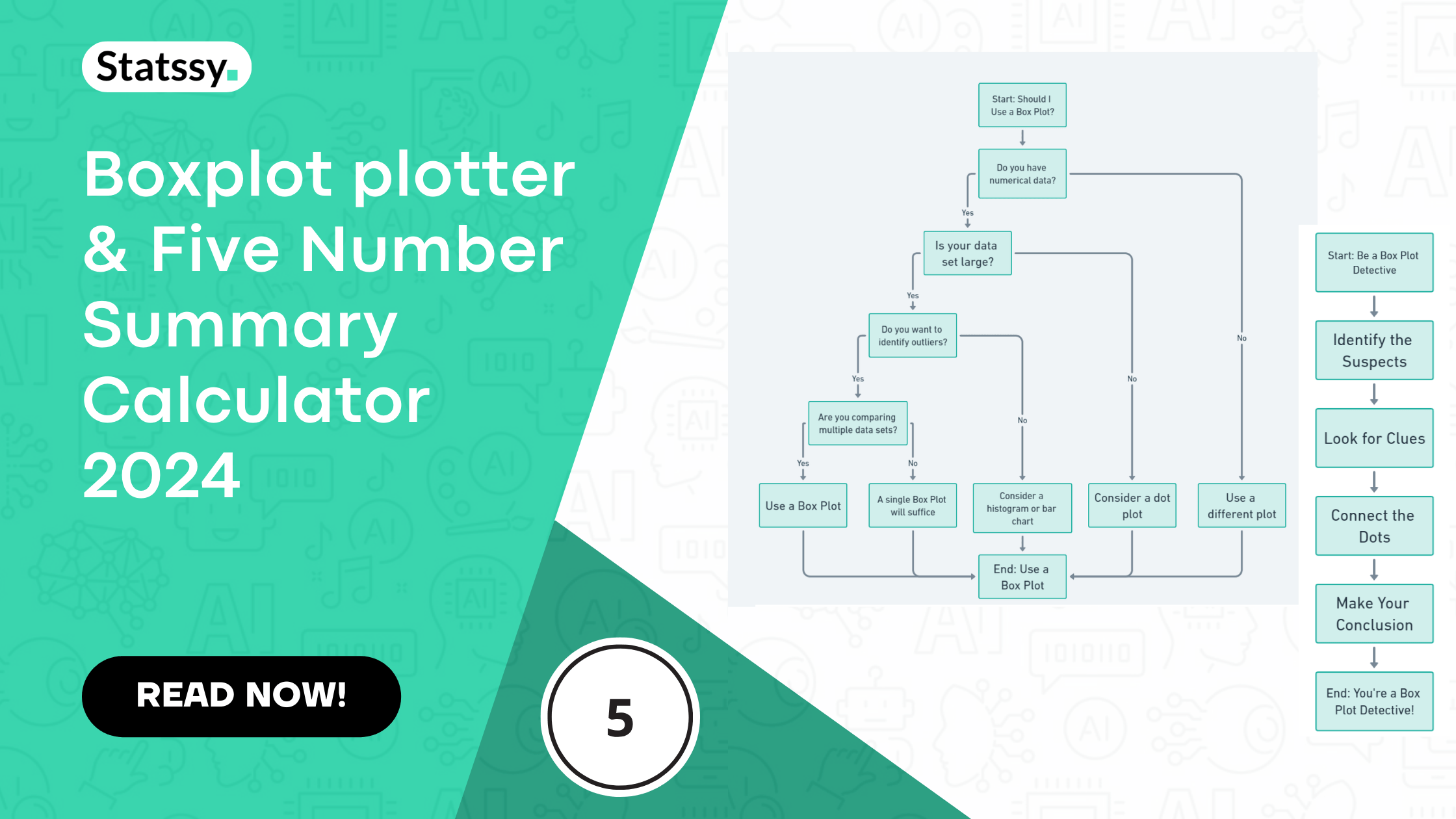
Be a Box Plot Detective
Alright, super sleuths, it’s time to put on your detective hats! You’ve got the clues, you’ve met the suspects, and now it’s time to solve the mystery of the Box Plot. Just like solving a whodunit, interpreting a Box Plot involves looking for clues and making connections.
- Identify the Suspects: First, get to know the elements of your Box Plot—the median, quartiles, and outliers.
- Look for Clues: Pay attention to the spread and skewness. Are there any unusual patterns?
- Connect the Dots: How do the different elements relate to each other? Is the median closer to the upper or lower quartile?
- Make Your Conclusion: After examining all the clues, what does the Box Plot tell you about your data?
Imagine a flowchart that guides the reader through the steps of interpreting a Box Plot, complete with emojis:
- Identify the Suspects: “Get to know the median, quartiles, and outliers.”
- Look for Clues: “Examine the spread and skewness for unusual patterns.”
- Connect the Dots: “See how the different elements relate to each other.”
- Make Your Conclusion: “What does the Box Plot reveal about your data?”
Each step in the flowchart would be clickable, leading to a brief explanation or tip for interpreting Box Plots.

The Good, the Bad, and the Box Plot
Hey there, data aficionados! So, you’ve learned how to read a Box Plot and even solve its mysteries. But hold up! Just like superheroes have their strengths and weaknesses, Box Plots have their pros and cons. Let’s explore when to use them and when to give them a pass.
- The Good: What makes Box Plots awesome?
- The Bad: Where do Box Plots fall short?
- The Ugly Truth: Sometimes, a Box Plot just isn’t the right tool for the job.
| The Good | The Bad |
|---|---|
| Easy to Understand | Can Oversimplify Data |
| Compact Visual Summary | Limited Detail |
| Identifies Outliers Easily | Not Ideal for Complex Data |
When to Use a Box Plot?

How to Use the Decision-Making Flowchart
Navigating the world of data visualization can be a bit overwhelming, especially when you’re trying to decide which type of plot or chart to use. That’s where our decision-making flowchart comes in handy! Think of it as your personal GPS for the journey through Box Plot territory.Five Number Summary
Step 1: Numerical Data
Start at the beginning of the flowchart where it asks, “Do you have numerical data?” If your answer is “Yes,” move on to the next question. If it’s “No,” the flowchart suggests you opt for a different type of plot. Box Plots are best suited for numerical data, so if you’re working with categories or text, you might want to consider other options like bar charts or pie charts.
Step 2: Data Set Size
The next stop asks, “Is your data set large?” If you’re dealing with a large set of numbers, a Box Plot can provide a compact visual summary. If your data set is small, the flowchart suggests considering a dot plot instead, which can be more informative for smaller sets.
Step 3: Outliers
Then comes the question, “Do you want to identify outliers?” If spotting those data rebels is important to you, proceed along the “Yes” path. If not, you might want to consider a histogram or bar chart, which are better suited for showing frequency distributions without focusing on outliers.
Step 4: Comparing Data Sets
Finally, the flowchart asks, “Are you comparing multiple data sets?” If you are, then a Box Plot is an excellent choice as it allows for easy comparison between different sets of data. If you’re only looking at a single data set, a single Box Plot will suffice.
By the end of this guided journey, you’ll arrive at your destination: the decision on whether or not to use a Box Plot for your specific needs.
Section 9: Box Plots IRL (In Real Life)
So, you’ve become a Box Plot pro, but you might be wondering, “Where will I actually use this in real life?” Great question! Box Plots are not just theoretical constructs; they’re used in various fields to make sense of real-world data. Let’s take a virtual safari to see where you’ll find these handy plots in the wild!
- Gaming Stats: How do your Fortnite skills compare to others?
- Social Media Analytics: What’s the best time to post on Instagram for maximum likes?
- Stock Market Trends: How volatile is that stock you’re eyeing?
- Healthcare Data: What’s the average wait time at emergency rooms?
| Field | Description | Example Use Case |
|---|---|---|
| Gaming Stats | Analyzing player scores and rankings in multiplayer games. | Fortnite player score distribution |
| Social Media Analytics | Understanding user engagement metrics like likes, shares, and comments. | Best time to post on Instagram |
| Stock Market Trends | Assessing the volatility and trends of different stocks. | Apple stock price fluctuations |
| Healthcare Data | Evaluating patient wait times, treatment effectiveness, etc. | Average wait time at emergency rooms |
Conclusion: That’s a Wrap!
Wow, what a journey we’ve been on, right? From unravelling the mysteries of Box Plots to becoming detectives and even taking a safari to see Box Plots in the wild, we’ve covered a lot of ground!
Key Takeaways:
- What’s a Box Plot: We kicked things off by understanding what a Box Plot is and its various components.
- The Fab Five: We met the five key numbers that make a Box Plot tick.
- Outliers Unplugged: We learned how to spot the rebels in our data.
- Box Plot Building Blocks: We got into the nitty-gritty of what makes a Box Plot.
- Be a Box Plot Detective: We became sleuths, learning how to interpret Box Plots.
- The Good, the Bad, and the Box Plot: We weighed the pros and cons of using Box Plots.
- When to Use a Box Plot: We used a decision-making flowchart to determine when a Box Plot is the right tool for the job.
- Box Plots IRL: We saw real-world applications of Box Plots, from gaming stats to healthcare data.