Hey there, aspiring data analysts! Ever wondered how your favourite songs of 2023 are performing across various platforms? Or maybe you’re curious about what makes a song a hit? Well, you’re in the right place! We’re about to embark on an exciting journey to analyze the most famous songs of 2023 using Python.
Why Are We Doing This?
Data analysis is not just about crunching numbers; it’s about telling a story. By the end of this blog, you’ll be able to understand the trends in popular music, compare how songs are doing on different platforms like Spotify and Apple Music, and even see how various audio features affect a song’s popularity. Plus, you’ll gain hands-on experience in Python, which is a super valuable skill in today’s job market.
The Dataset
We’ll be using a fantastic dataset that includes a comprehensive list of the most famous songs of 2023 as listed on Spotify. This dataset is a goldmine, offering a wealth of features such as track name, artist(s) name, release date, and even various audio features like tempo and key. You can download the dataset from this Kaggle link.
What Will You Learn?
Ah, the golden question! What’s in it for you, right? Well, let’s break down the potential use cases and what you can expect to learn from each. We’ll also touch on why these analyses could be super valuable in a business context.
Music Analysis
What You’ll Learn:
We’ll dig into various audio features like tempo (beats per minute), key, mode (major or minor), and many more. You’ll learn how to interpret these features and understand what makes a song popular or dance-worthy.
Business Use-Case:
For music producers and record labels, understanding the trends in audio features can help in the production of future hits. Knowing what kind of music resonates with the audience can be a game-changer.
Platform Comparison
What You’ll Learn:
We’ll compare how songs are performing on different music platforms like Spotify, Apple Music, Deezer, and Shazam. You’ll get insights into which platform gives songs the most visibility and traction.
Business Use-Case:
For marketers and advertisers, this information is gold. Knowing where a song performs best can help in targeted advertising and promotional efforts.
Artist Impact
What You’ll Learn:
Ever wondered if songs by solo artists perform better than collaborations? We’ll analyze how the number of contributing artists relates to a song’s success in terms of streams and chart presence.
Business Use-Case:
Talent agencies and record labels can use this data to strategize their artist collaborations. It helps in understanding whether a solo or a multi-artist approach is more beneficial.
Temporal Trends
What You’ll Learn:
We’ll look at how music attributes and preferences have evolved over time, focusing on release dates. Are people more into upbeat songs in the summer? Do slow jams rule the winter? Let’s find out!
Business Use-Case:
Understanding temporal trends can help in the timing of song releases. For example, if upbeat songs are more popular in the summer, that’s the perfect time for such releases.
So, as you can see, not only will you gain some awesome Python skills, but you’ll also learn how to analyze data in a way that has real-world, business applications.
How Will We Proceed?
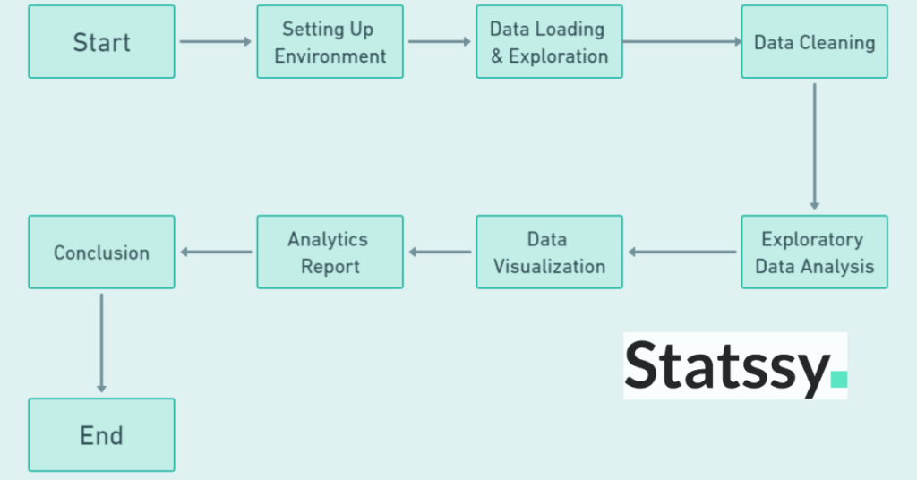
To give you a roadmap, here’s a flowchart that outlines the steps we’ll be taking:
Setting Up Your Environment
Alright, folks! Now that we’re all pumped up about what we’re going to learn, let’s get our hands dirty by setting up our coding environment. Don’t worry; it’s easier than you think! We’ll be using Jupyter Notebook for this tutorial because it’s super user-friendly and perfect for data analysis projects.
Step 1: Download Anaconda
First things first, we need to download Anaconda, which is a free and open-source distribution of Python. It comes with a lot of handy tools and libraries that make life easier for data scientists and analysts.
Download Anaconda from this link.
Step 2: Open Jupyter Notebook
Once you’ve installed Anaconda, you can easily open Jupyter Notebook from the Anaconda Navigator or by simply typing jupyter notebook in your terminal or command prompt.
- Open Anaconda Navigator and click on ‘Jupyter Notebook’, or
- Open your terminal (Mac/Linux) or command prompt (Windows) and type
jupyter notebook.
Either way, it will open a new tab in your web browser with Jupyter’s dashboard.
Step 3: Install Relevant Libraries
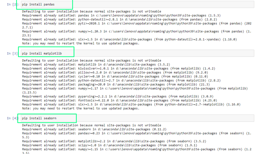
Before we dive into the data, we need to install some Python libraries that will help us along the way. In a new Jupyter Notebook, you can install these libraries by running the following commands:
!pip install pandas
!pip install matplotlib
!pip install seaborn
This is how you have to do this, write each of these commands in separate cells in Jupyter Notebook and run, you will see something like this. As I have these libraries already installed, so it shows “Requirement Already Satisfied”, but in your case you might see different output.
Step 4: Import the Libraries
After installing, let’s import these libraries so we can use them in our project. Add the following lines at the top of your Jupyter Notebook:
import pandas as pd
import matplotlib.pyplot as plt
import seaborn as sns
When you run this code, you will see something like this,

The red color part shows that this cell executed successfully and libraries are imported. You might wonder what does this mean?
Step 5: Understanding the Import Statements
For some of you just starting out, these lines of code might look like some sort of secret language. But don’t worry, I’ll demystify them right now!
What are Libraries?
In Python, a library is essentially a collection of pre-written code that you can use to perform common tasks. Think of it like a toolbox —you don’t need to build a hammer from scratch every time you want to nail something; you just grab one from your toolbox.
Why These Libraries?
- Pandas: This is your go-to library for anything related to data manipulation and analysis. It’s particularly good for working with tabular data (like Excel spreadsheets).
- Matplotlib: This is a plotting library. Want to create some charts or graphs? Matplotlib has got you covered.
- Seaborn: Built on top of Matplotlib, Seaborn helps you create more attractive and informative statistical graphics. It’s like Matplotlib but with a style upgrade.
The Import Statements Explained
import pandas as pd: Here, we’re importing the Pandas library and giving it a nickname—pd. So, whenever we want to use a function from Pandas, we’ll use this shorthand. For example,pd.read_csv()to read a CSV file.import matplotlib.pyplot as plt: Similarly, we’re importing a specific part of the Matplotlib library calledpyplotand naming itplt. This is the part of Matplotlib that we’ll use for most of our plotting needs.import seaborn as sns: Last but not least, we’re importing Seaborn and calling itsns. This is the conventional shorthand for Seaborn, and you’ll see it in most tutorials and documentation.
How to Use Them?
Once imported, you can use the functions and methods from these libraries by referencing their shorthand names. For example:
- To read a CSV file using Pandas:
pd.read_csv('your_file.csv') - To create a simple line chart using Matplotlib:
plt.plot([1, 2, 3], [1, 4, 9]) - To create a stylish histogram using Seaborn:
sns.histplot(data, bins=20)
And there you have it! You’re now familiar with the magical lines of code that will be your best friends in this data analysis journey.
Data Loading and Exploration
Alright, now that our environment is all setup, it’s time to get our hands on the data! In this section, we’ll load our dataset into our Python environment and take a first look at it. Trust me, this is where the fun begins!
Step 1: Download the Dataset
First, you’ll need to download the dataset from Kaggle. The file will be named spotify-2023.csv. You can download it from this Kaggle link.
Step 2: Load the Dataset
Once you’ve downloaded the dataset, it’s time to load it into our Jupyter Notebook. We’ll use Pandas for this, which makes it super easy. Here’s how:
# Load the dataset into a Pandas DataFrame
df = pd.read_csv('spotify-2023.csv', encoding='latin-1')
In this line, df stands for DataFrame, which you can think of as a table where our data will reside. ‘latin-1’ is the encoding which means if there is some other format, it gets imported correctly. (Don’t worry about that too much for now!)
Step 3: Explore the Structure
Let’s take a quick look at the first few rows of our dataset to get a feel for what we’re working with.
# Display the first 5 rows of the DataFrame
df.head()
When you run this command you will see an output like this,
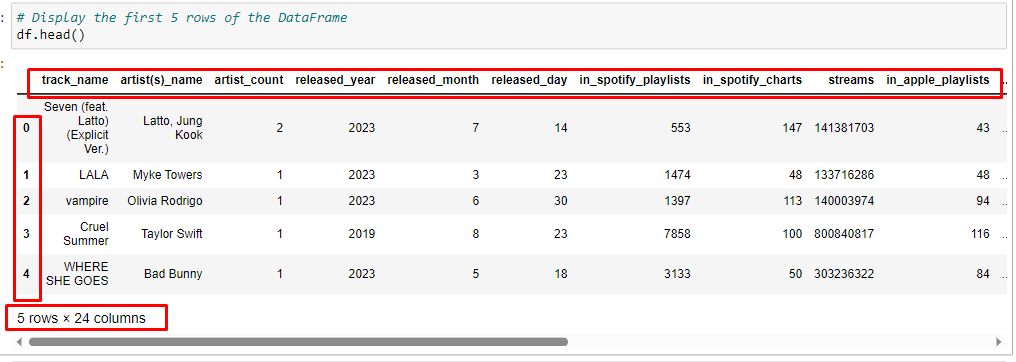
Here you can see, it shows that we have 5 rows and 24 columns. It is because `df.head()` is a command which shows the first 5 records in the dataset and all the columns in the dataset.
Interpreting the Output of df.head()
Fantastic, you’ve successfully loaded the dataset and displayed the first few rows! Let’s break down what we’re looking at:
Column Descriptions
- track_name: The name of the song.
- artist(s)_name: The name(s) of the artist(s) who performed the song.
- artist_count: The number of artists who contributed to the song.
- released_year, released_month, released_day: The release date of the song, broken down into year, month, and day.
- in_spotify_playlists: The number of Spotify playlists that feature this song.
- in_spotify_charts: The song’s rank on Spotify charts.
- streams: The total number of streams on Spotify.
- in_apple_playlists: The number of Apple Music playlists that feature this song.
- …: And many more audio features like bpm (beats per minute), key, mode, and various percentages indicating danceability, valence, energy, etc.
Sample Data
- The first row, for example, tells us about the song “Seven (feat. Latto) (Explicit Ver.)” by artists Latto and Jung Kook. It was released on July 14, 2023, and has been included in 553 Spotify playlists. It ranks 147th on Spotify charts and has a total of 141,381,703 streams. The song is also present in 43 Apple Music playlists.
- The second row tells us about the song “LALA” by Myke Towers, released on March 23, 2023. It’s included in a whopping 1474 Spotify playlists and ranks 48th on Spotify charts.
What Does This Mean?
- We have a mix of numerical and categorical data. Numerical data includes columns like
streams,in_spotify_playlists, andbpm. Categorical data includes columns liketrack_name,artist(s)_name, andmode(Major/Minor). - The dataset is quite rich, offering a variety of features that can be analyzed to gain insights into song popularity, artist impact, and much more.
Let’s take a moment to understand what we mean by “numerical” and “categorical” data. These are terms you’ll hear a lot in data analysis, so it’s essential to get familiar with them.
Numerical Data
Numerical data represents quantities or counts. In simple terms, they are numbers that you can perform mathematical operations on. For example, you can add, subtract, multiply, or find the average of numerical data.
- In Our Dataset: Columns like
streams,in_spotify_playlists, andbpm(beats per minute) are numerical. You can calculate things like the average number of streams or the highest bpm in the dataset.
Categorical Data
Categorical data represents categories or labels. These are usually text-based and describe characteristics that can be sorted or grouped but not mathematically computed.
- In Our Dataset: Columns like
track_name,artist(s)_name, andmode(Major/Minor) are categorical. You can’t add or average these, but you can group the data by these categories. For example, you could find out how many songs are in Major mode versus Minor mode.
To make it super clear, let’s organize our columns into a table that shows which ones are numerical and which ones are categorical. This will serve as a quick reference as we go along with our analysis.
| Column Name | Type of Measurement | Reason for Categorization |
|---|---|---|
track_name | Categorical | The name of each song is a label or category, and you can’t perform mathematical operations on it. |
artist(s)_name | Categorical | The name of the artist or artists is also a label, and it doesn’t make sense to add or average names. |
artist_count | Numerical | This is the number of artists who contributed to a song, and you can perform calculations like finding the average number of artists per song. |
released_year | Numerical | The year a song was released is a numerical value that can be used in calculations, such as finding the oldest or newest song in the dataset. |
released_month | Numerical | Similar to released_year, the month of release is a numerical value that can be used in calculations. |
released_day | Numerical | The day of the month a song was released is also numerical and can be used in calculations. |
in_spotify_playlists | Numerical | This represents the count of Spotify playlists that feature the song. You can calculate things like the average number of playlists a song appears in. |
in_spotify_charts | Numerical | This is the song’s ranking on Spotify charts, which is a numerical value. You could, for example, find the average ranking of songs. |
streams | Numerical | This is the total number of times the song has been streamed, which is a count that can be used in various calculations. |
in_apple_playlists | Numerical | Similar to in_spotify_playlists, this is a count of how many Apple Music playlists feature the song. |
bpm | Numerical | Beats per minute is a numerical measure of the tempo of the song. You can calculate the average bpm across songs, for example. |
key | Categorical | The musical key (e.g., C, C#, D, etc.) is a category that the song falls into. You can’t perform mathematical operations on musical keys. |
mode | Categorical | This indicates whether the song is in Major or Minor mode, which are categories. You can’t average or sum this data. |
danceability_% | Numerical | This is a percentage indicating how suitable the song is for dancing. Being a numerical value, you can calculate its average, minimum, or maximum across songs. |
valence_% | Numerical | This percentage indicates the positivity or happiness level of the song. It’s numerical and can be used in calculations. |
energy_% | Numerical | This represents the energy level of the song as a percentage. You can calculate things like the average energy level across songs. |
acousticness_% | Numerical | This is the percentage of acoustic sound in the song. It’s a numerical value that can be used in various calculations. |
instrumentalness_% | Numerical | This percentage indicates how much of the song is instrumental. Being numerical, you can calculate its average, for example. |
liveness_% | Numerical | This percentage indicates the presence of live performance elements in the song. It’s numerical and can be used in calculations. |
speechiness_% | Numerical | This is the percentage of spoken words in the song. Being a numerical value, you can perform various calculations on it. |
Why Does This Matter? : (Project in Data Analysis using Python)
Understanding the type of data you’re working with helps you decide what kind of analysis you can perform. For instance:
- With numerical data, you might want to find the average or the range.
- With categorical data, you might want to count how many times each category appears.
So, knowing the difference between numerical and categorical data is like knowing when to use a hammer and when to use a screwdriver in your toolbox of data analysis tools. This is just the tip of the iceberg! We’ll dig deeper as we move along, but for now, this gives us a good starting point.
Ready to move on to checking the data types and basic statistics?
Step 4: Check Data Types
It’s essential to know what kind of data we’re dealing with. Are they numbers? Text? Dates? Let’s find out.
# Check the data types of each column
df.dtypes
Once you run this command, you will see something like this in your jupyter notebook, where you will see two columns, first is the name of the column in your dataset and second is the type of column as understood by python.
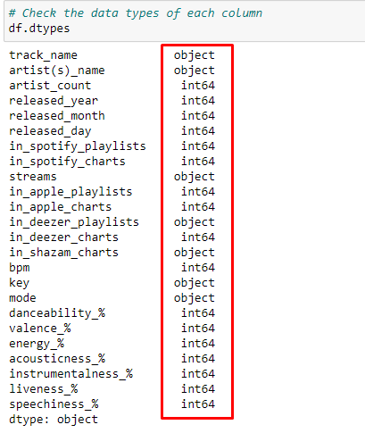
Understanding Data Types with df.dtypes
Great, you’ve successfully checked the data types of each column in your DataFrame using df.dtypes. Let’s organize this information into a table and explain what each data type means. We’ll also identify any columns where the data type might need to be changed.
| Column Name | Data Type in Python | Explanation | Needs Change? |
|---|---|---|---|
track_name | object | Integer numbers are suitable for counts. | No |
artist(s)_name | object | Integer numbers, are suitable for counts. | No |
artist_count | int64 | Integer numbers, are suitable for month values. | No |
released_year | int64 | Textual data is considered as strings in Python. | No |
released_month | int64 | Integer numbers, suitable for month values. | No |
released_day | int64 | Integer numbers, suitable for day values. | No |
in_spotify_playlists | int64 | Integer numbers, suitable for counts. | No |
in_spotify_charts | int64 | Integer numbers, suitable for ranking positions. | No |
streams | object | Textual data, but this should be numerical for analysis. | Yes |
in_apple_playlists | int64 | Integer numbers, suitable for counts. | No |
in_apple_charts | int64 | Integer numbers, suitable for ranking positions. | No |
in_deezer_playlists | object | Textual data, but this should be numerical for analysis. | Yes |
in_deezer_charts | int64 | Integer numbers, suitable for ranking positions. | No |
in_shazam_charts | object | Textual data, but this should be numerical for analysis. | Yes |
bpm | int64 | Integer numbers, suitable for beats per minute. | No |
key | object | Textual data, considered as strings in Python. | No |
mode | object | Textual data, considered as strings in Python. | No |
danceability_% | int64 | Integer numbers, suitable for percentages. | No |
valence_% | int64 | Integer numbers, suitable for percentages. | No |
energy_% | int64 | Integer numbers, suitable for percentages. | No |
acousticness_% | int64 | Integer numbers, suitable for percentages. | No |
instrumentalness_% | int64 | Integer numbers, suitable for percentages. | No |
liveness_% | int64 | Integer numbers, suitable for percentages. | No |
speechiness_% | int64 | Integer numbers, suitable for percentages. | No |
Explanation
- object: This is generally used for textual data (strings).
- int64: This represents integer numbers, which are whole numbers that can be positive, negative, or zero.
Needs Change?
- Columns like
streams,in_deezer_playlists, andin_shazam_chartsare read asobject(textual data), but they should be numerical for proper analysis. You’ll need to convert these to the appropriate numerical data type, likelyint64.
Understanding the data types of each column will better equip you to handle the data effectively. Knowing which columns need to be changed is the first step in cleaning your data, an important part of any data analysis project.
Step 5: Basic Statistics
Before diving deep, it’s always good to get some basic statistics about our dataset. This will give us an overview of the numerical features.
# Get basic statistics for each column
df.describe()
When you run this command, you will see an output something like this,

Interpreting df.describe() in a Business Context
The df.describe() function gives us a statistical summary of the numerical columns in our dataset. Let’s organize this information into a table and then interpret what these statistics could mean in a business context.
| Statistical Measure | artist_count | released_year | released_month | released_day | in_spotify_playlists | in_spotify_charts | in_apple_playlists | in_apple_charts | in_deezer_charts | bpm | danceability_% | valence_% | energy_% | acousticness_% | instrumentalness_% | liveness_% | speechiness_% |
|---|---|---|---|---|---|---|---|---|---|---|---|---|---|---|---|---|---|
| Count | 953 | 953 | 953 | 953 | 953 | 953 | 953 | 953 | 953 | 953 | 953 | 953 | 953 | 953 | 953 | 953 | 953 |
| Mean | 1.56 | 2018.24 | 6.03 | 13.93 | 5200.12 | 12.01 | 67.81 | 51.91 | 2.67 | 122.54 | 66.97 | 51.43 | 64.28 | 27.06 | 1.58 | 18.21 | 10.13 |
| Std Dev | 0.89 | 11.12 | 3.57 | 9.20 | 7897.61 | 19.58 | 86.44 | 50.63 | 6.04 | 28.06 | 14.63 | 23.48 | 16.55 | 26.00 | 8.41 | 13.71 | 9.91 |
| Min | 1 | 1930 | 1 | 1 | 31 | 0 | 0 | 0 | 0 | 65 | 23 | 4 | 9 | 0 | 0 | 3 | 2 |
| 25th Percentile | 1 | 2020 | 3 | 6 | 875 | 0 | 13 | 7 | 0 | 100 | 57 | 32 | 53 | 6 | 0 | 10 | 4 |
| Median | 1 | 2022 | 6 | 13 | 2224 | 3 | 34 | 38 | 0 | 121 | 69 | 51 | 66 | 18 | 0 | 12 | 6 |
| 75th Percentile | 2 | 2022 | 9 | 22 | 5542 | 16 | 88 | 87 | 2 | 140 | 78 | 70 | 77 | 43 | 0 | 24 | 11 |
| Max | 8 | 2023 | 12 | 31 | 52898 | 147 | 672 | 275 | 58 | 206 | 96 | 97 | 97 | 97 | 91 | 97 | 64 |
Interpretation
- Artist Count: On average, songs have about 1.56 artists contributing. This could indicate that collaborations are not extremely common but do occur. Businesses could consider promoting collaborative songs as special events.
- Release Year: The average release year is around 2018, indicating that the dataset mostly contains relatively recent songs. This is important for businesses focusing on current trends.
- Spotify Playlists: Songs appear in an average of 5200 Spotify playlists. This is a key indicator of a song’s popularity and reach. Businesses could use this data to decide which songs to feature in marketing campaigns.
- Apple Playlists: The average presence in Apple playlists is around 68, which is significantly lower than Spotify. This could indicate a marketing opportunity on this platform.
- Danceability: The average danceability score is approximately 67%. Songs that are more danceable may be more popular in settings like parties or clubs.
- Valence (Positivity): The average valence score is around 51%, indicating that songs in the dataset have a balanced mood, neither too happy nor too sad. This could be useful for businesses like retail stores where a neutral ambience is often desired.
- Energy: The average energy level is around 64%, which is moderately high. High-energy songs might be better suited for workout playlists or sports events.
- Streams: Although not shown in the table, the
streamscolumn is crucial for understanding how many times a song has been played, which directly correlates to its popularity. - Inconsistencies: Columns like
streams,in_deezer_playlists, andin_shazam_chartsneed to be converted to numerical types for proper analysis.
Understanding these statistics can help businesses make informed decisions, such as which songs to include in advertising campaigns or what kind of music to play in different business settings.
25th Percentile (Lower Quartile)
- Artist Count: Most songs (25% of them) have only one artist involved. This could mean that solo projects are quite common, and businesses might focus on these for simpler licensing deals.
- Spotify Playlists: 25% of songs are in 875 or fewer Spotify playlists. These could be considered “niche” or “less popular” and might be good for specialized marketing campaigns.
- Apple Playlists: 25% of songs are in 13 or fewer Apple playlists. This could indicate a subset of songs that are less popular on this platform, perhaps offering a marketing opportunity.
- Danceability: 25% of songs have a danceability score of 57% or less, making them less suitable for dance-focused events or venues.
50th Percentile (Median)
- Artist Count: The median value is 1, reinforcing that most songs are solo projects. This is a key insight for businesses looking to license music.
- Spotify Playlists: The median number of Spotify playlists a song appears in is 2224. This could be considered the “average” popularity level for songs in this dataset.
- Apple Playlists: The median presence in Apple playlists is 34, again much lower than Spotify, suggesting a different user behaviour or market dynamics on this platform.
- Danceability: The median danceability score is 69%, indicating that the “average” song in this dataset is fairly danceable.
75th Percentile (Upper Quartile)
- Artist Count: 75% of songs have 2 or fewer artists. Collaborations are not extremely common but do happen. Businesses might consider these for special promotions or events.
- Spotify Playlists: 75% of songs are in 5542 or fewer Spotify playlists. Songs above this could be considered “hits” and might be the focus of major marketing campaigns.
- Apple Playlists: 75% of songs are in 88 or fewer Apple playlists. Songs above this are likely the most popular on this platform and could be targeted for promotions.
- Danceability: 75% of songs have a danceability score of 78% or less. Songs above this are likely to be very danceable and could be targeted for events like parties or clubs.
Understanding these quartiles can help businesses segment their music choices based on popularity, danceability, or other features, allowing for more targeted marketing or usage.
Let me know if you like this tutorial to this point. I will upload the remaining parts if someone places a request for it.


